Kitchen Renovations in Fairfax, VA
Refined Modern: Liberating space through refined design
Architect: Christiane deJong AIA
Getting Acquainted
For more than twenty years, Bonnie and her husband Jake* had been living in a very unique 1960s modern home located in Mantua, a beautiful community in Fairfax County. With their children grown, they finally had the resources to begin their dream kitchen renovation project in their Fairfax, Virginia home. They knew this would be a process that would require both structural alterations and heavy renovation. They needed a Fairfax architect.
As a talented cook, Bonnie had always considered her small kitchen the creative center of her home. Because her kitchen was a cramped interior space without windows, it required a much-needed refresh. What she needed was an architects thoughtful, period inspired design talent that she could foster in a collaborative working relationship. She had ideas honed in the years spent cooking in her kitchen. She wanted those realized in this renovation and, with this in mind, she reached out to Christiane.
Identifying Next Level Kitchen Renovation Opportunities
While touring Bonnie’s home, the first thing we noticed was the light. Beautiful morning sunlight flooded the sitting and breakfast rooms adjacent to the existing kitchen. Unfortunately, the only natural light entering the kitchen itself came through a subdued pass-through window. The 60s-style cabinets were dark, the counter was beige laminate, and the floor was beige vinyl with a single central rectangular fluorescent fixture serving as the light source. It was a perfect time capsule ready for us to open, assess and reinvigorate.

An open kitchen must be designed to be seen from a distance. The design must accommodate functionality while creating minimal lines and surfaces
We asked Bonnie to complete our “Kitchen Inventory + Preferences” questionnaire and then interviewed her about how she used the space: how did she store everything she needed in this small space? Did she prefer to cook alone or while socializing? What types of countertop appliances did she keep here? What were her goals for this kitchen remodel? Her answers provided us with everything we needed to begin considering her future dream kitchen.
Developing the Design Together
We started with a shared “ideabook” and asked Bonnie to begin saving images of materials, along with images of kitchens and kitchen features she admired. This gave our team a sense of her specific wants and needs and a glimpse of the aesthetics she preferred. We added images and tested ideas we thought would compliment Bonnie’s strong sensibility and retro-inspired style.

Fewer walls make planning for adequate storage more challenging. Every wall, under counter space and alcove become an opportunity for more cabinet space
In developing the new kitchen layout, Christiane focused on creating a wide-open space. Bonnie agreed that it was time for the walls to come down. An open kitchen is a very different kind of design challenge than creating a galley style kitchen. To do this we would need a clever way to manage storage that relied less on wall cabinets. We noticed, in looking closely, that the three doors opened into this small space. This meant that much of the existing footprint was dedicated to circulation. We realized there was an opportunity with a more open kitchen to sacrifice two of the doors without hampering movement. This modification gave us more wall space as a location for full-height storage and base cabinets.
Visualizing the Changes
In the first design meeting, we proposed three different layouts, and together, she and Bonnie discussed the pros and cons associated with each. Christiane presented live 3D models that allowed Bonnie to spin around and see what each of the designs would look like in her home. Once Bonnie had selected the preferred schematic layout, we spent time developing the exact cabinet combination that would meet her specific storage needs. Christiane encouraged her to mentally move into the space to be sure that all items had been considered. Then as the process continued, the architect presented “look” boards and tile samples that she and Bonnie spent luxurious hours discussing. The material palette and lighting selected at this stage would play a critical role in the final character of the space.

Often a more efficient floor plan can be found by looking carefully at existing circulation paths
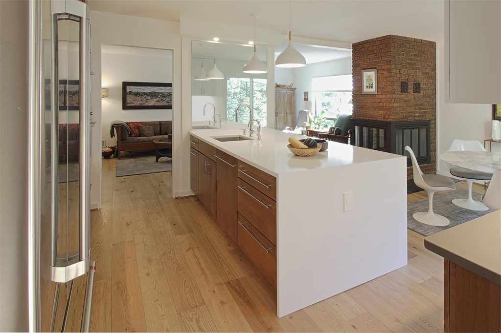
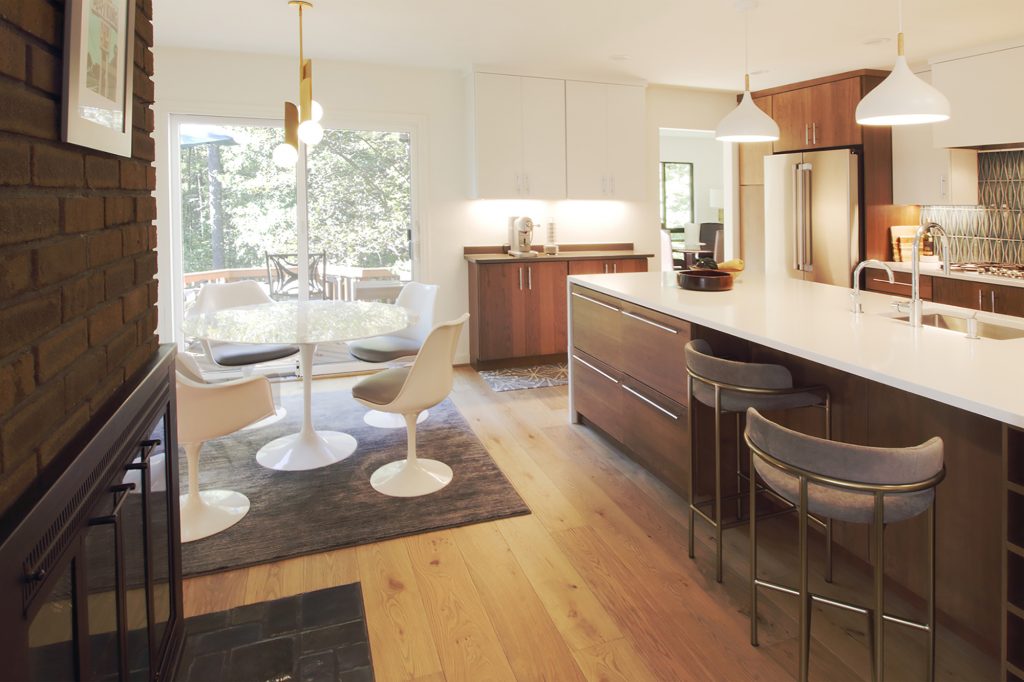
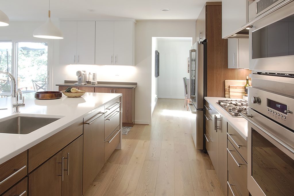
The design that resulted is a modern, light-filled, high-functioning kitchen that is an integral part of the breakfast area and adjacent sitting room. In using warm wood tones, matte chalk white cabinets, and a rich emerald green 60s retro ceramic backsplash, we assembled a combination of colors and materials that perfectly complement the earthy palette of the existing fireplace and slate hearth. The new design integrates almost invisibly into the existing style and first floor of the home. Bonnie, who is living her culinary dream, is thoroughly pleased with the job well done.
*Names have been changed to protect our clients privacy.
